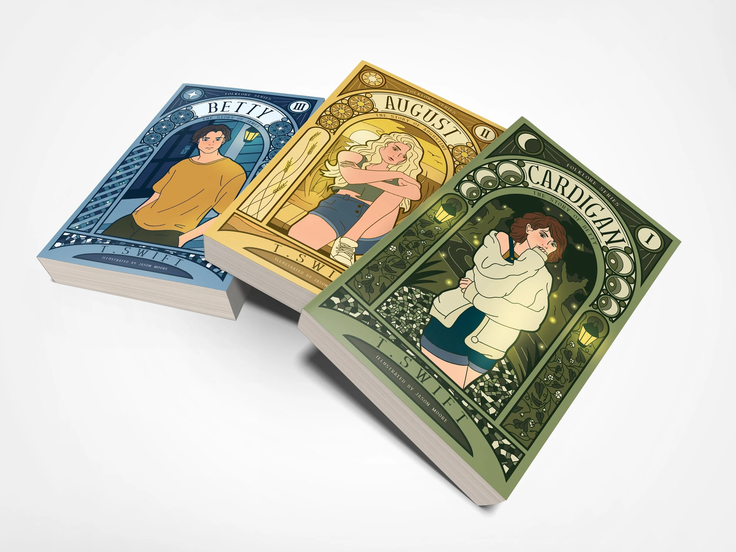
My topic of illustration was the Folklore book series inspired by the teenage love trilogy from Taylor Swift’s album, Folklore. This was a conceptual topic as this book series does not actually exist.
In gathering inspiration for each of these book cover illustrations, I listened to the song lyrics of cardigan, august, and betty, and referenced fan-based theories on the characters from these songs. It was actually quite the rabbit hole to go down, so I found myself throwing out a lot of the more complex theories and imageries for imagery that were more in line with the visuals of the album itself. The album was released during the fall/winter season and had themes of folk, natural, and mystical imagery. I wanted to capture that in the designs for each character. I also wanted each cover to capture the energy of each of these characters.
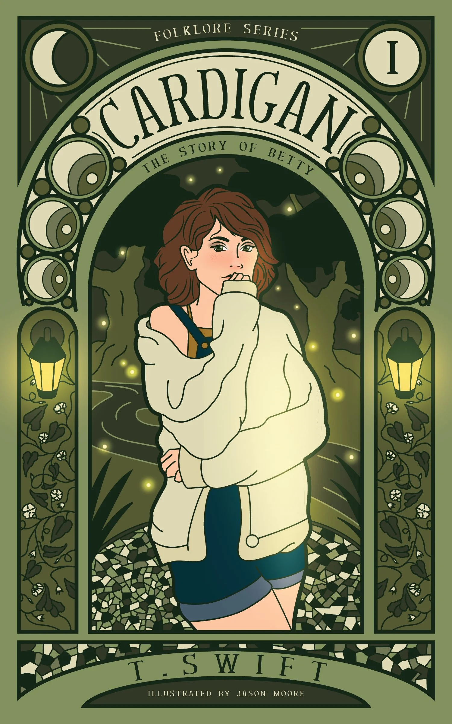
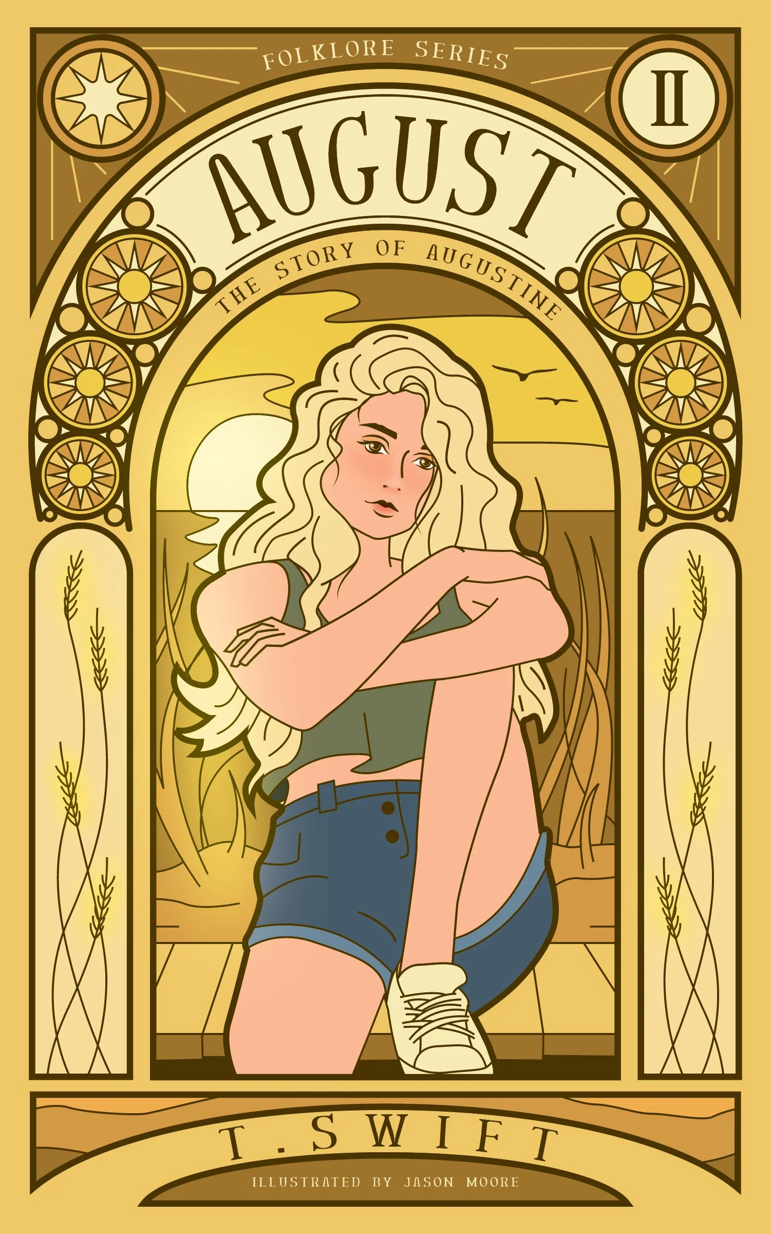
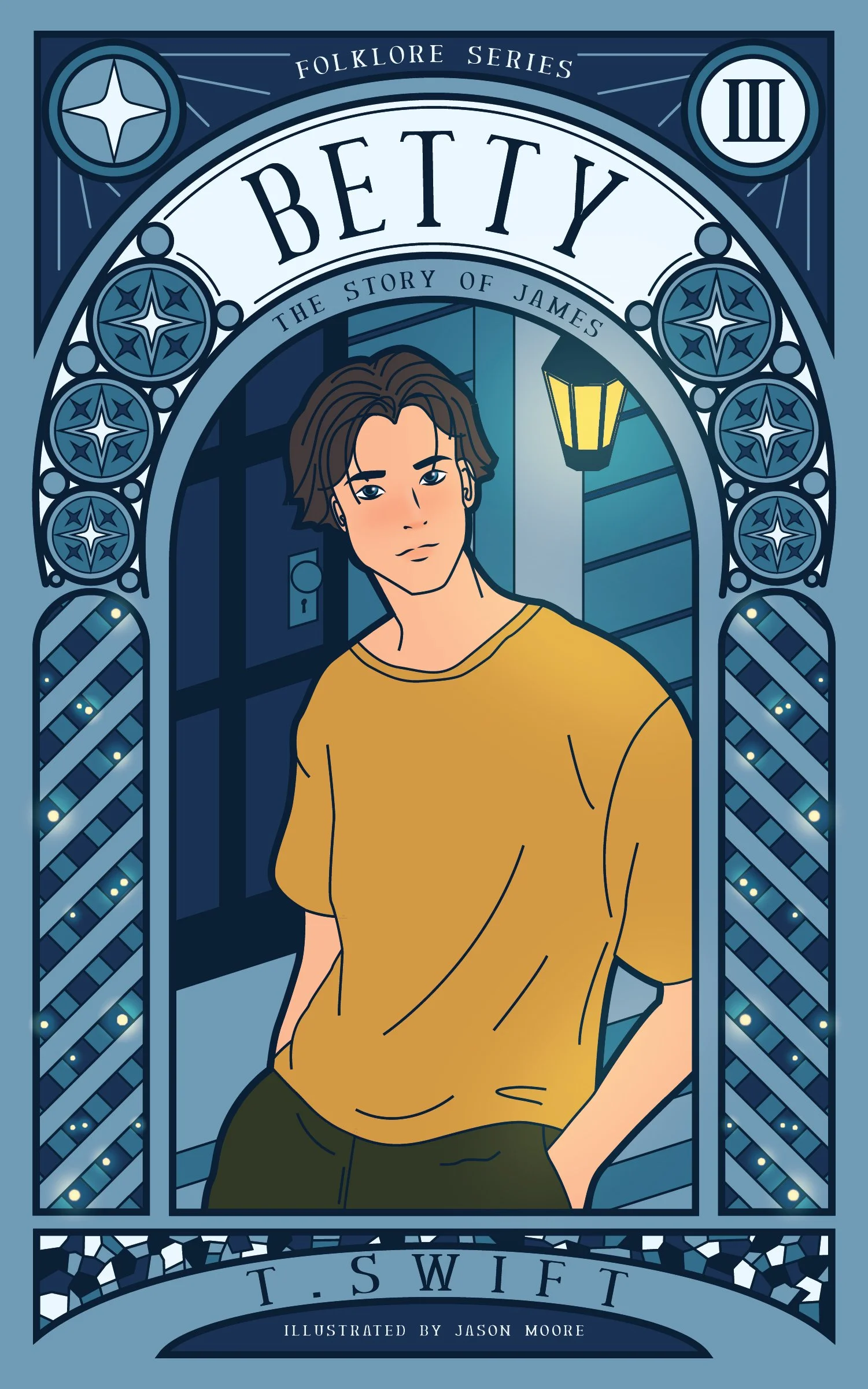
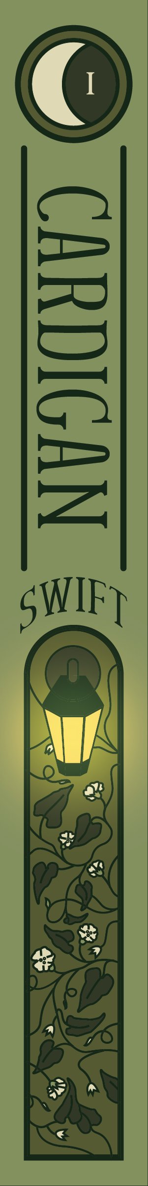
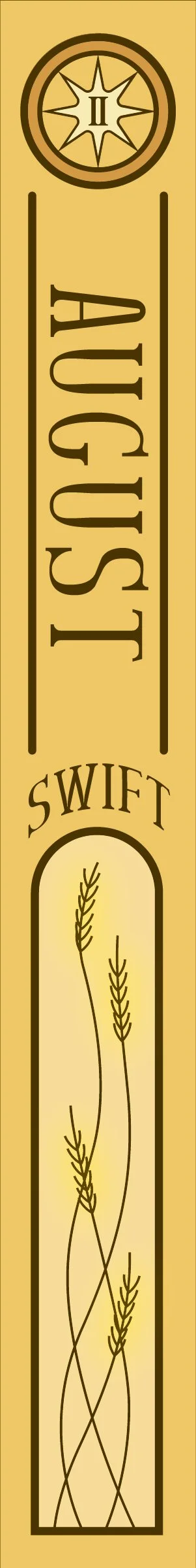
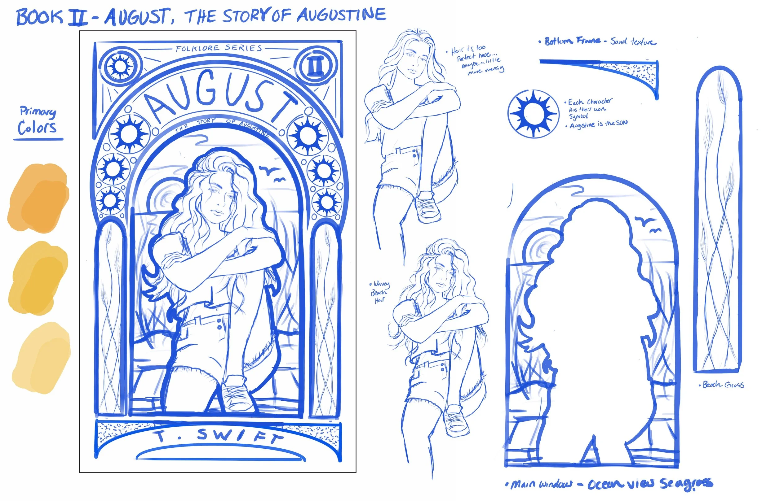
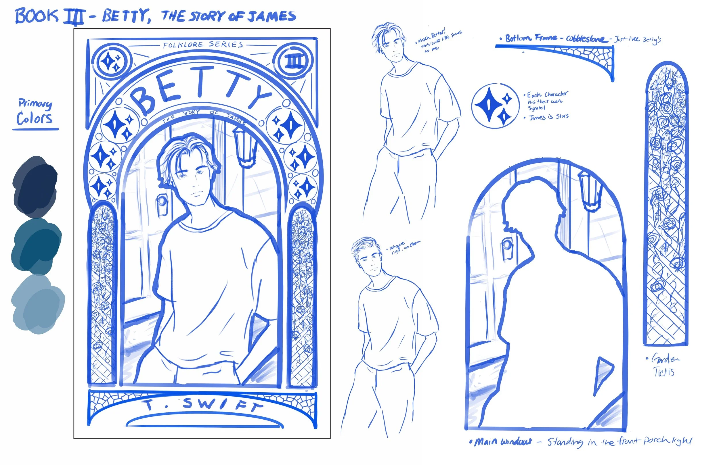
Cardigan is about Betty, someone I imagine is more down-to-earth and eccentric. Her charm comes from her quirkiness. I won’t go too deep into the imagery for each cover because there is a lot to read between the lines, but I chose woodland green hues for this cover. Betty’s symbol is also the moon. Betty and James are the first to be in love and have a budding romance up until the school dance, when they have a falling out. August is about Augustine, the summer romance and rebound of James. I chose coastal beach imagery and golden yellow hues. This song takes place at the coast during summer vacation, where the two teenagers spend a summer of romance together. Augustine’s symbol is the sun because she is outgoing and warm with a sun-kissed summer glow. Finally, Betty is told from James’ point of view. This is his apology letter to Betty, saying he screwed up and wanted her back. Ultimately Betty and James end up together, as confirmed by Taylor, but James really put Betty through it. For James’ book, I chose a bluish color scheme with imagery of a front door, porch, and lantern. In the song, James shows up to Betty’s house to make the apology on the night of her birthday party. James’ symbol is the stars. This is because stars belong with the moon and not with the sun.
For all three books, I wanted a similar cover layout with variations in character, imagery, and primary colors. The art nouveau style also inspired me in my idea stage. I felt that this style would best communicate the folk/mystical style I was hoping to reflect from the mood of the album. I kept the shading and highlighting of the forms relatively simple because the amount of imagery is already so extensive. I felt that simplistic shapes and forms would give the complex design room to breathe. In referencing art nouveau, I found examples of this simplicity in the figures. There was rarely any highlighting and shading in the figures aside from subtle blushing and highlights in faces. I thought this was a simple and beautiful way to draw the eye to the figure’s face as a focal point in the middle of the complex graphic elements of the art nouveau style. This is the same approach I have taken with flat illustrations of the characters and subtle shading and highlights in the faces. I also wanted light to be a common thread throughout all three book covers. You will see this through lamps, fireflies, sunlight, and light sources that are glowing and bouncing off the characters.