
Exploring a theoretical solution for fast fashion consumption among Gen Z
Jason Moore • MFA Graphic Design Thesis Project
Liberty University, Summer 2024
VISUAL PROCESS
BEGINNING THE VISUAL PROCESS
The visual process of this thesis was one of research, planning, trial, and error – all of which led me to the eventual final design solutions showcased here. To begin, I explored many options for the name of the brand through a combined use of word lists and mind-mapping. After narrowing down the name options, I eventually chose the name “Project ReThread.” With a name for the brand chosen, I dove into the dynamic process of developing Project ReThread’s logo and brand identity. This began with extensive research and meticulous planning, essential for laying a strong brand foundation and visual identity. Initial stages involved generating word lists, mind-mapping, and curating moodboards to encapsulate the brand’s essence and aesthetic direction. Transitioning from ideation to execution, I sketched 30 thumbnail concepts using Procreate on the iPad, exploring diverse ideas that would resonate with the target audience, Gen Z.
As the process unfolded, decisions materialized, leading to the selection of a definitive logo and the inception of a comprehensive brand guideline. With a solid foundation in place, I then moved on to the creation of the digital and print assets for this campaign. These assets include a website, social media posts, social media playbooks, posters, ads, and non-traditional assets. As a whole, this visual process highlights a deliberate approach to design, supported by research, to promote a commitment to authenticity and sustainability, ensuring every facet aligns seamlessly with Project ReThread’s mission and vision.
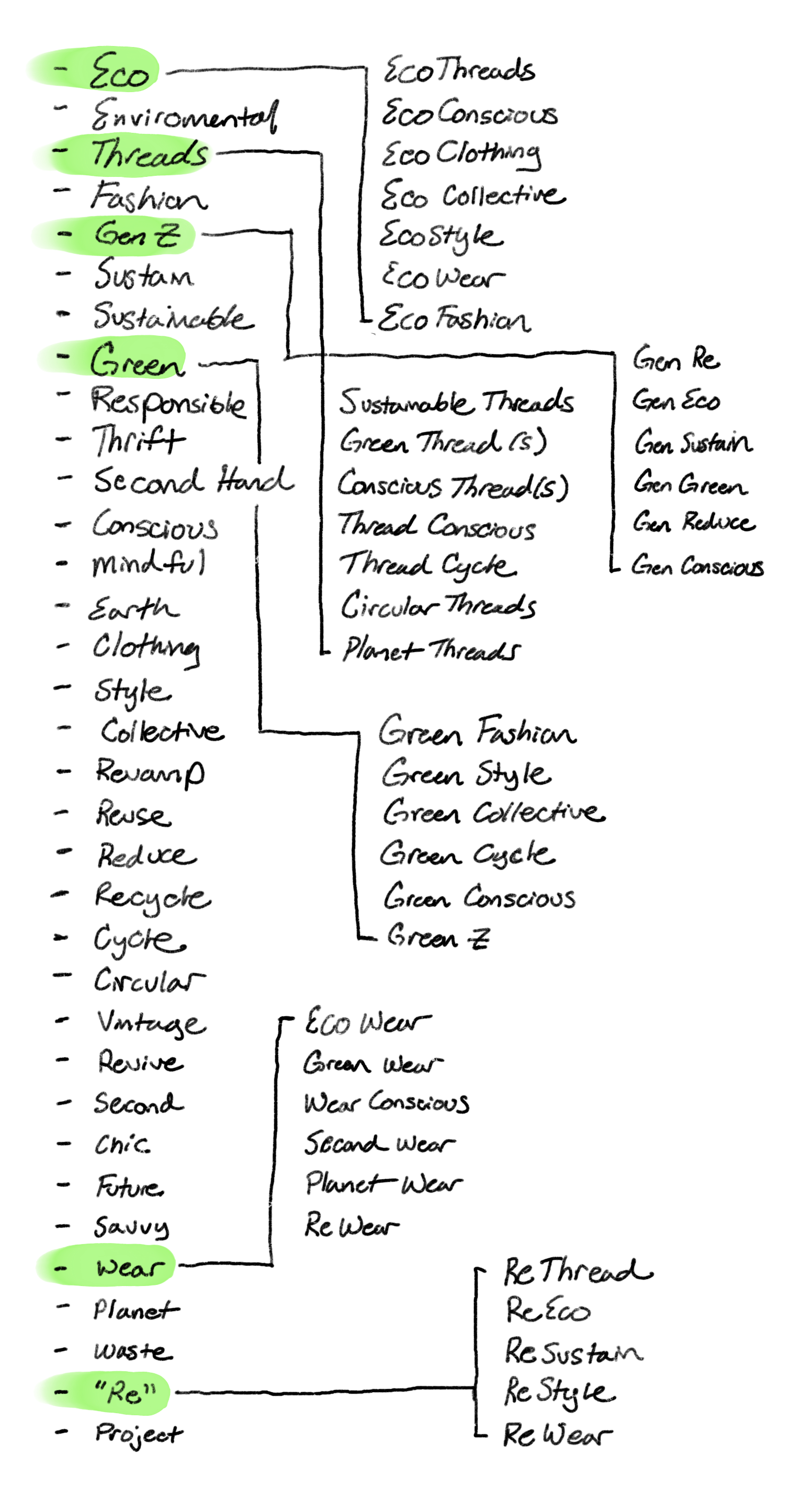
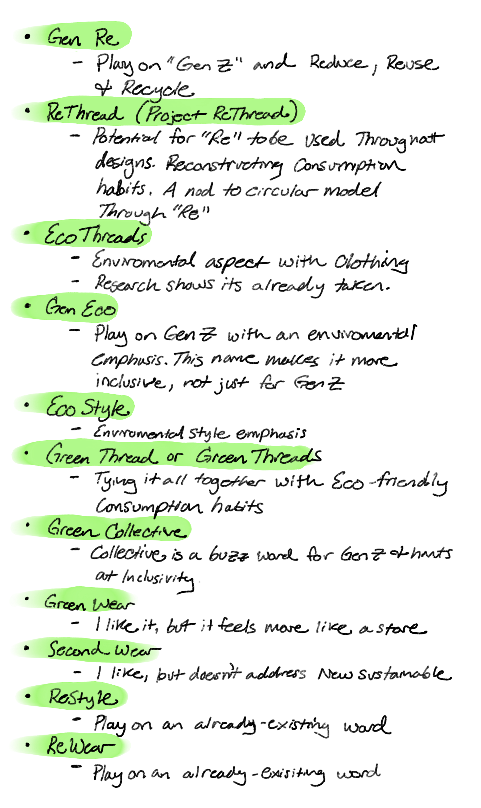
WORDLIST & MINDMAP
The creation of this non-profit project began with extensive planning and research. The purpose of this was to create a memorable name for the project as well as a strong visual brand identity to be associated with the name. Through word lists and mind maps, I explored any words associated with sustainability, fashion, and Gen Z. With the list, I mapped and combined certain words to create unique combinations. Through trial and error, I eventually settled on “Project ReThread” for its memorability, simplicity, and instant association with the purpose of the brand mission, reusing and reducing fashion consumption, specifically among Gen Z. Through further research, I did find that there was already a known fashion brand titled “Rethread.” With this discovery, it was important for me to include the word “project” in the brand mark as a mark of distinction. It was also important to be aware that the visual identity I was creating was also significantly different from this already established clothing brand based in Amsterdam.
LOGO & BRAND MOODBOARD
With a decided name, I began researching inspiration for a visual identity surrounding the mission of Project ReThread. To collect the inspiration, I created a moodboard which is a collage of images, words, patterns, or objects that can be used to convey a feeling or idea. To do this, I utilized Pinterest. This section shows the initial process of how the logos, colors, and graphics began as a collection of inspiration. The selection of final styles and color is shown and discussed later in this chapter.
SKETCHING & COLOR PALETTE EXPLORATION
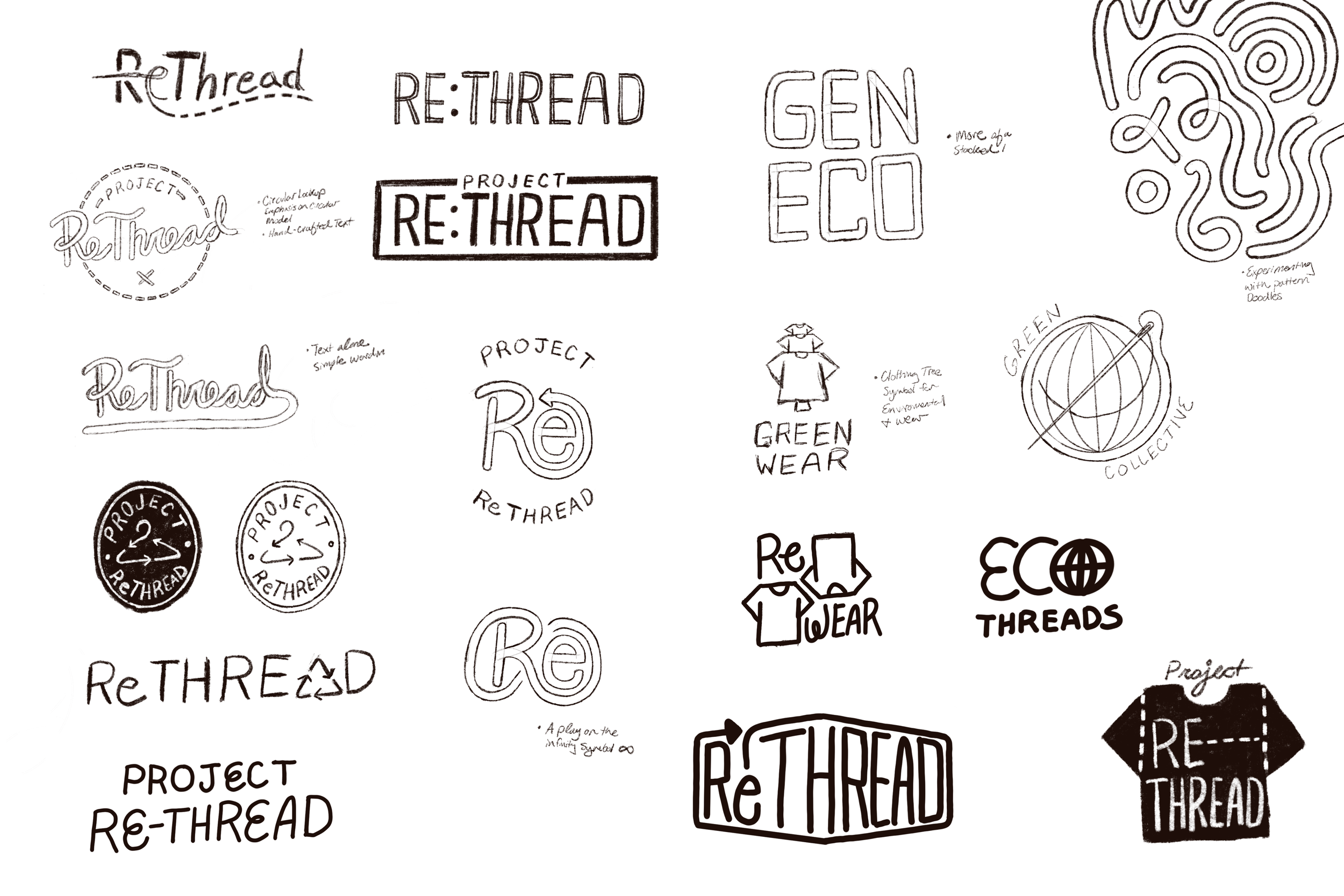
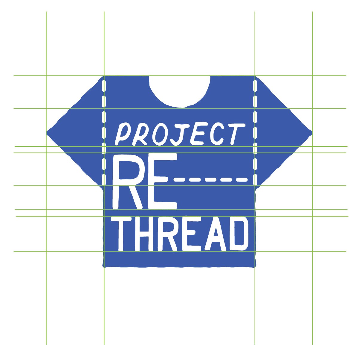
With the inspiration and research from the planning phase, I began sketching out some ideas for the logo brand mark while experimenting with a few of the names I narrowed down from my word lists and mindmaps. For some of the concepts, I explored different iconographic representations to include in the logos. For other concepts, I developed cleaner, strong word marks for the brand logo. While exploring these ideas, I created 30 thumbnail sketches for the logos. To do this, I utilized Procreate on my iPad to create and organize my sketched ideas.
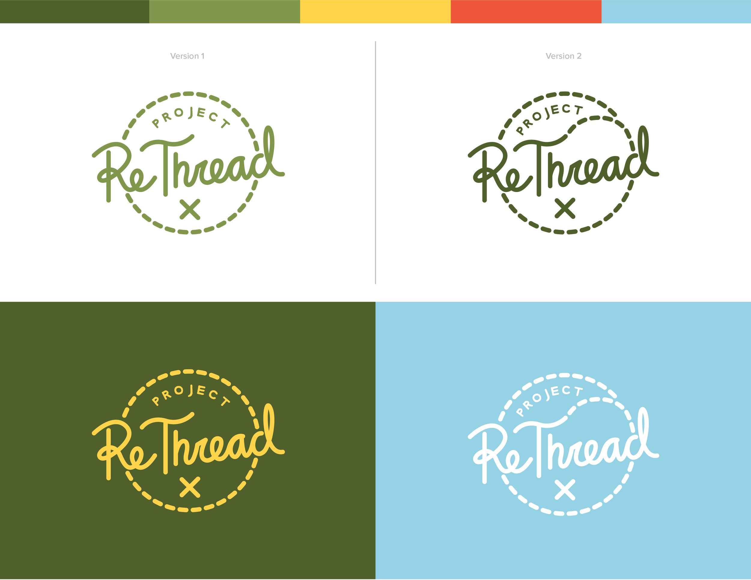
When exploring color palette options for the brand, I sought to create a palette with natural, earthly colors that leaned into the sustainable mission of the brand. I also combined brighter and neutral colors that catch the eye of young people as nostalgia and vintage flair are at the core of Gen Z style trends (Armstead). It was important to find a way to blend vivid color with vintage aesthetics. Keeping this in mind, I explored several different color palettes inspired by the 70s, 80s, 90s, and early 2000s. I utilized the web app, www.coolors.co, to create these color palettes. From a collection of seven palettes, I chose the top three palettes that I felt best achieved my three goals to experiment with in the logo draft phase.


LOGO ROUGHS
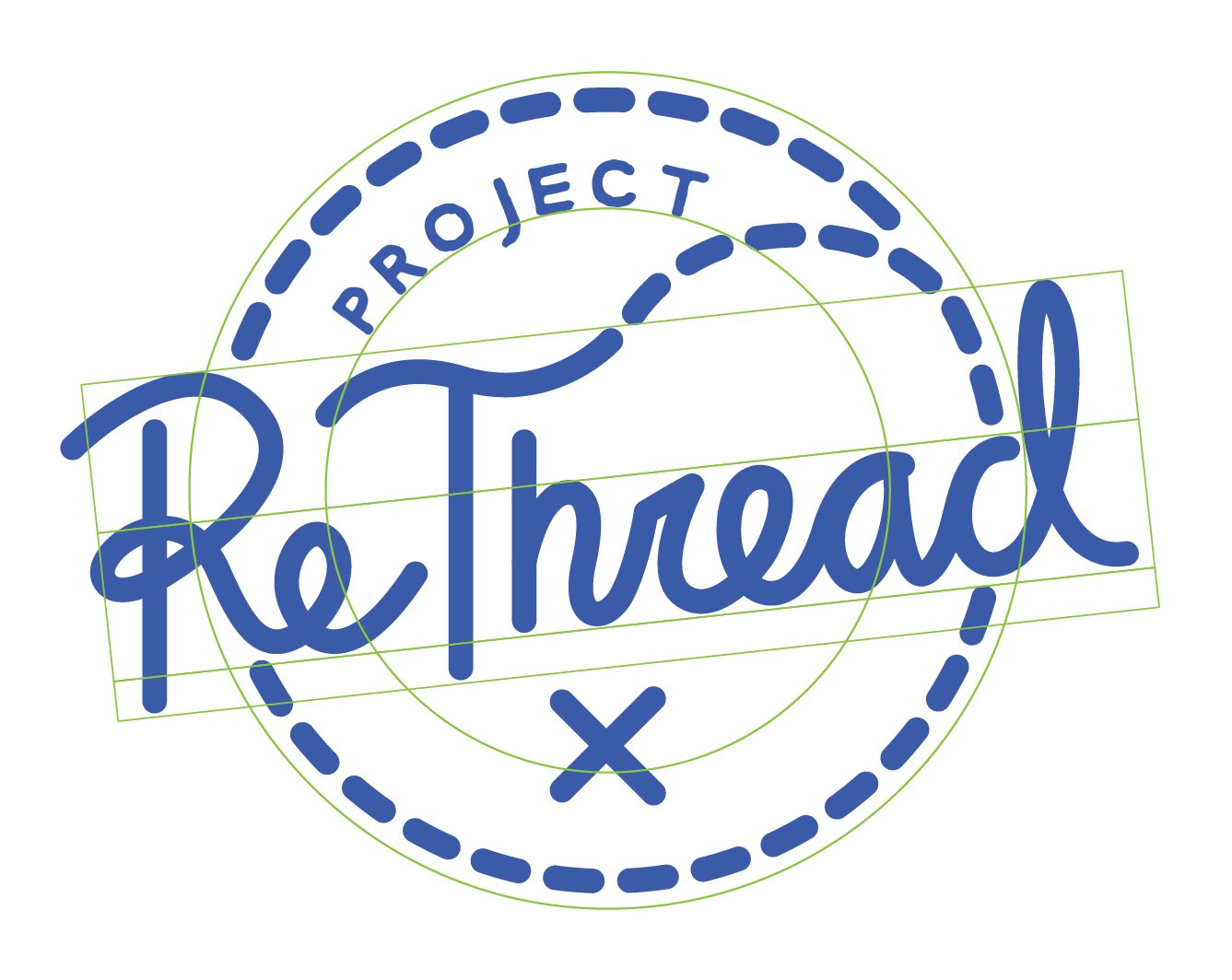
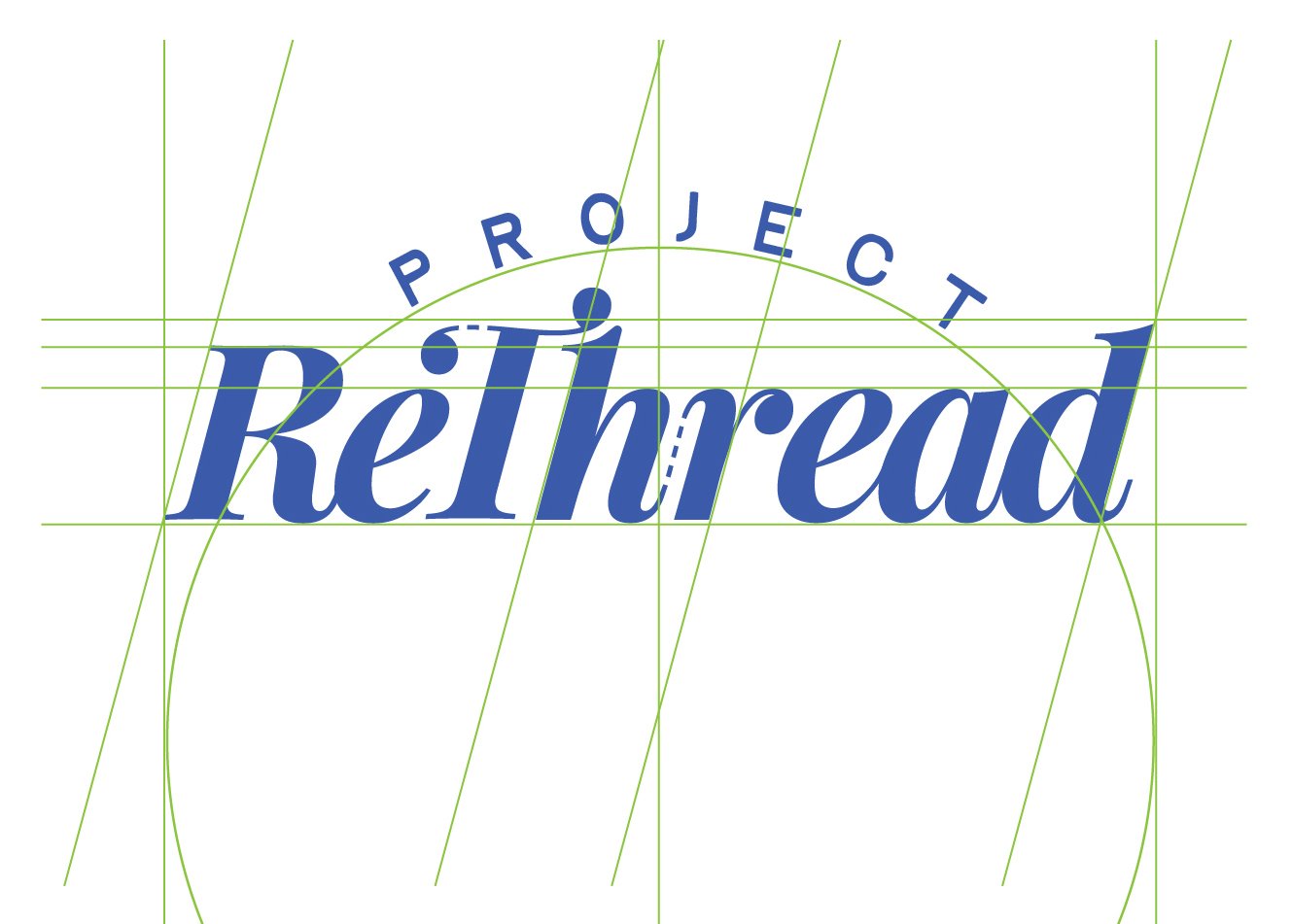
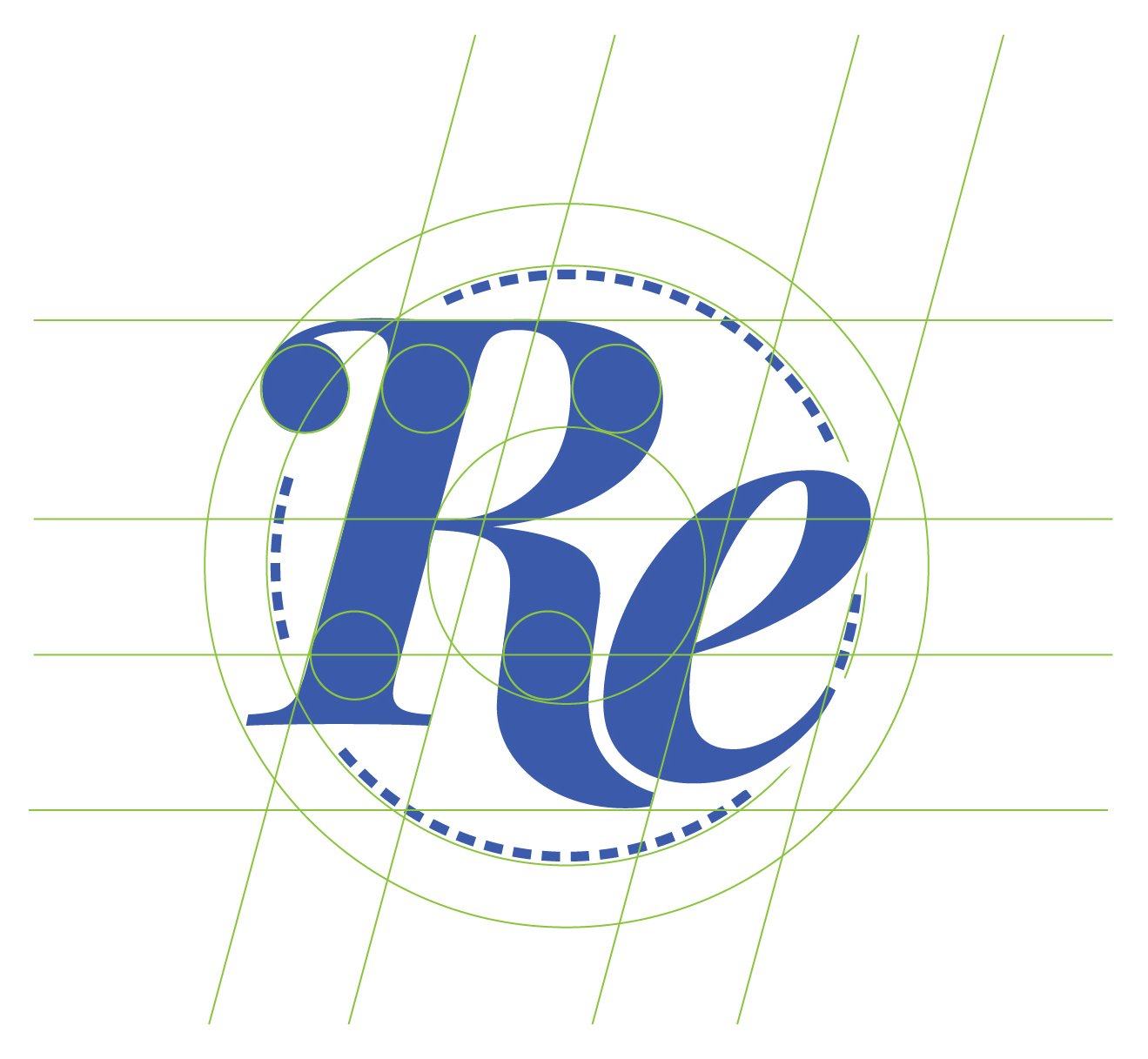
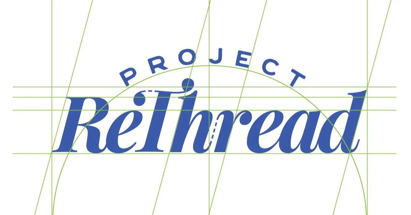
After planning and sketching were complete and the top color palettes were identified, it was time to move into Adobe Illustrator to begin creating the roughs that would become the drafts in color. The logo roughs were created by underlaying the sketches as a base and creating the roughs on top of them. I created guidelines and implemented principles of the golden ratio throughout the proportions of the logos, as demonstrated by green guidelines. The golden ratio is also referred to as the golden proportion, golden number, or the divine proportion. In addition to being exhibited throughout nature, examples of this ratio are seen in man-made works as early as 300 BCE, throughout classical Greek mathematics and geometry, and within numerous historical art movements. It is still used to today as a basis for art or design to create balanced, aesthetically pleasing works (Obermiller).
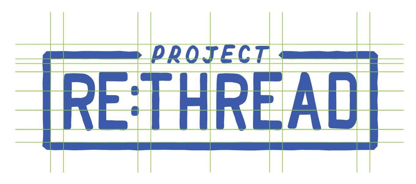
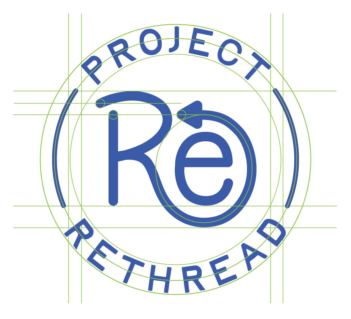
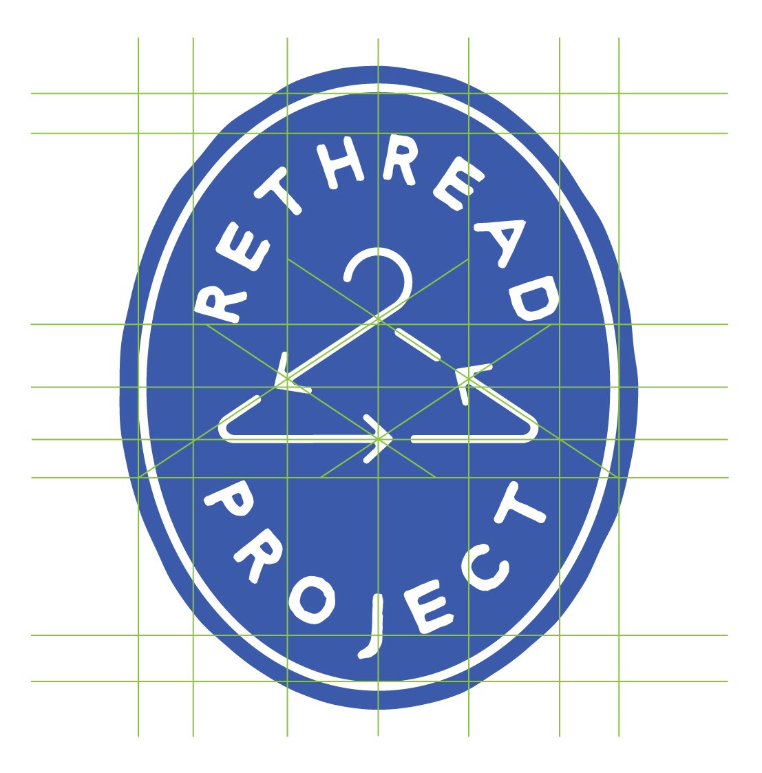
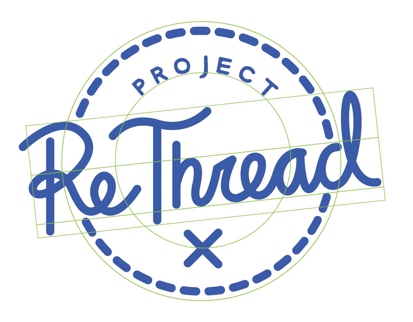
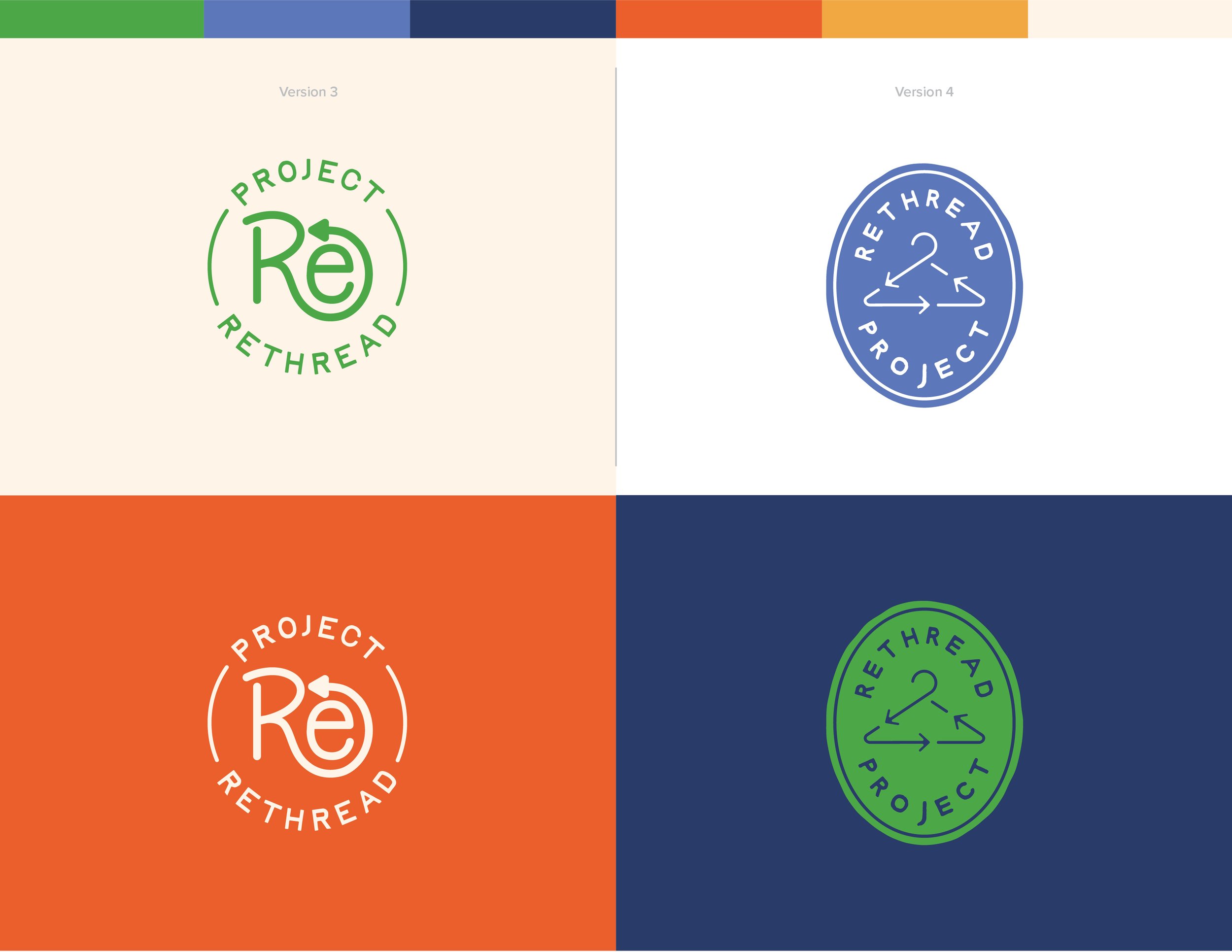
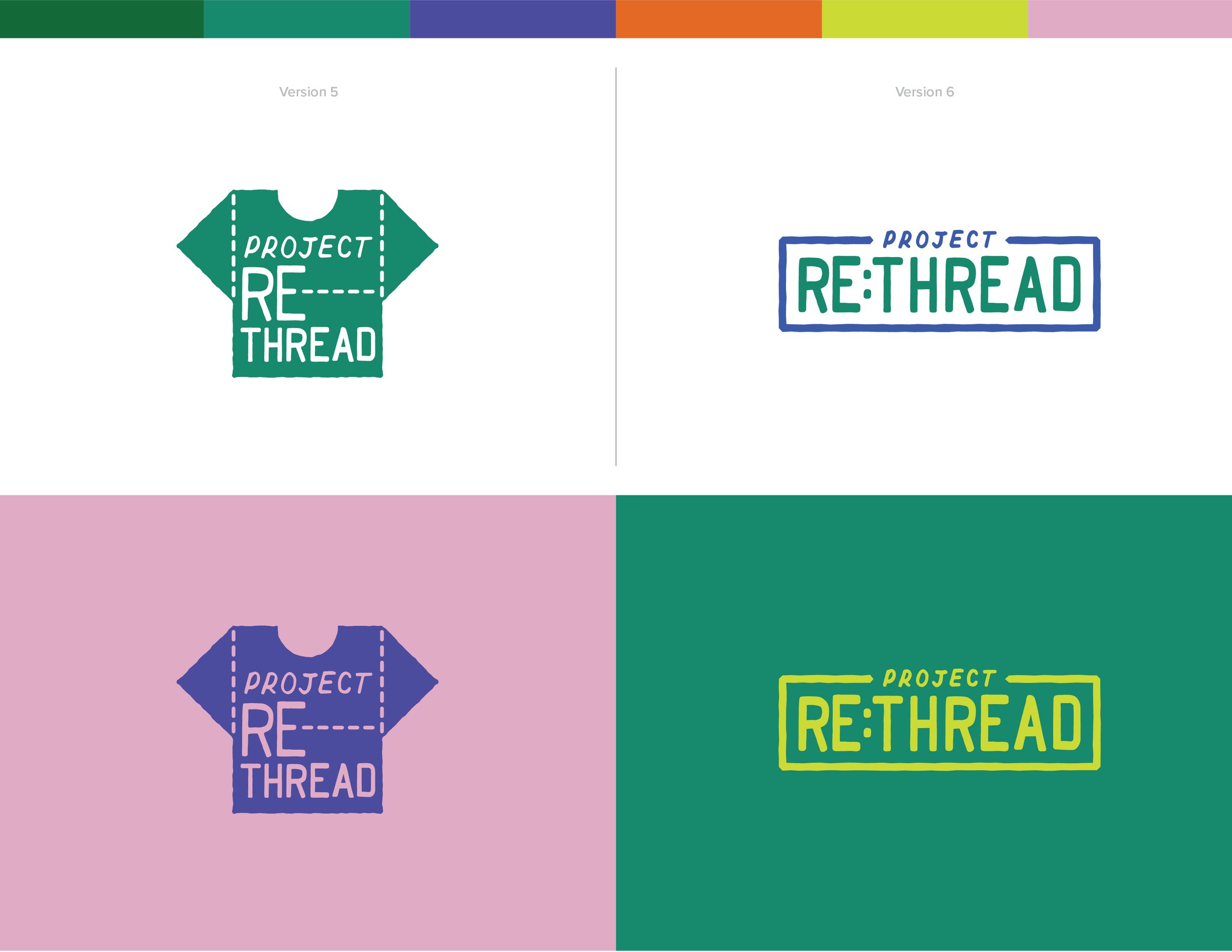
LOGO DRAFTS
With the logo roughs as a foundation, I created the drafted logo concepts utilizing the color schemes chosen earlier in the planning phase. These drafts showcased different color combinations and the flexibility of the brand marks in the context of these color palettes.

FINAL LOGO & BRANDING ADJUSTMENTS
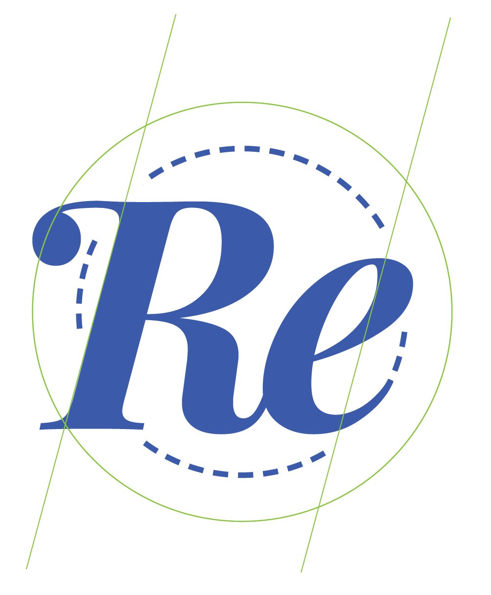
After an initial review of my logo marks, my committee suggested that I redraft the chosen brand mark from a hand-crafted script to more of a timeless serif. I was encouraged to think outside of the typical imagery and iconography used in fashion (i.e. shirts, hangers, etc.). Clichés, such as the examples given, tend to blend in with other competitors and lack memorability because they are so widely used (Crawford). With this feedback, I decided to create a strong wordmark for the logo with subtle stitch accents built into the lettering. I started with a base font (Playfair Display) and customized it by adjusting the individual characters to fit the overall brandmark, making a typeface for the logo that is unique to the brand. The result was a clean, timeless wordmark that could be used across the various pieces of my solution while providing an instant association to the brand identity.
It was during this time that I also chose a final color palette after a slight adjustment in the hue of the colors, most notably in the “Green Thread” brand color. After pairing the green color with some other visual assets, it became clear that I needed a slightly more muted green rather than the original vivid green. The new hue of green better accomplished the goal of both vintage and vibrant.
Upon further review from my committee, it was recommended that I make minor adjustments to the logo and brand icon to better balance the overall appearance of the marks. There were areas of unbalanced negative space that needed to be revisited. After discussing the logo and icon, I rebalanced the primary logo and reimagined the icon (Figs. 20-21). With these changes, the brand marks were stronger and more visually balanced, especially the icon.
WEBSITE PLANNING
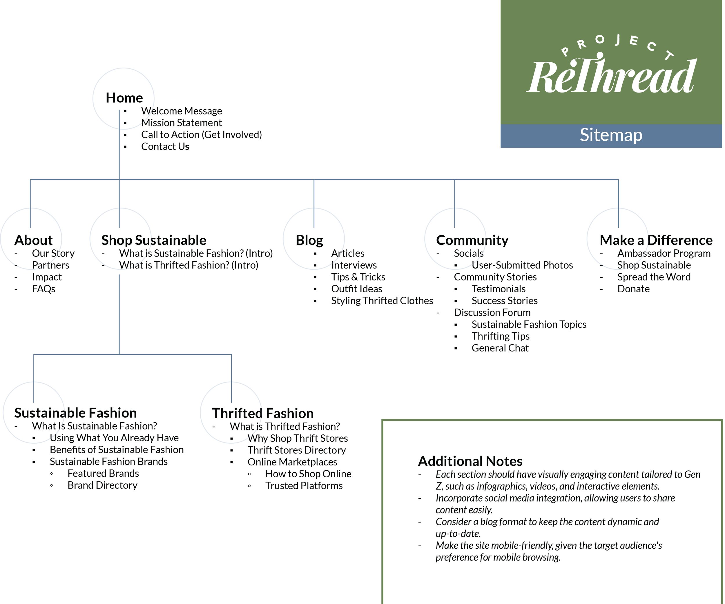
The brand marks solidified, it was time to create the digital and print assets that would become the driving elements of this campaign. In this effort, I began with the website as it is the one location that both the digital and print assets will point the viewer to for more information. The first step in web development was searching available URLs. To my surprise, www.projectrethread.org and www.projectrethread.com were both available. I immediately purchased hosting for the website and the two URLs, www.projectrethread.org, and www.projectrethread.com. Before starting the design, I created a sitemap to organize my thoughts and map out the information to be prioritized within the website structure. This overarching view of the website was helpful in planning the content and assets needed for the website.
One important consideration in website construction is SEO, also known as search engine optimization. SEO is the practice of optimizing web pages and content to rank higher in search engine results pages. The overall goal of SEO is to increase visibility and organic (non-paid) traffic from search engines like Google, Bing, and Yahoo. With there being other brands like “Rethread,” or the opportunity for users to mistype the name–for example, “Project Thread,” It is important to ensure that Project ReThread is the name that pops up when users are searching. There are two ways to increase the brand’s visibility on Google. The first and easiest method would be to pay for Google Ad placement around specific keywords. For example, using Google Ads, Project ReThread website could show up as a sponsored post at the top of search results when users search chosen keywords like rethread, project thread, and rethreaded. This method involves building and testing lists of keywords to see which ones would be the most effective (“Create a Search Campaign.”). The downside with this route is that is does cost money to buy ad space on Google Ads, which tends to be a precious resource for any non-profit organization. The second method is through good website structure utilizing best practices when it comes to SEO. Increasing the SEO of a website will increase its chances of showing up higher on the google search list, and this ultimately will not cost any money in exchange for a little more work up front on the website. To increase the SEO for the website, it is important to use descriptive URLs, reduce duplicate content, make headers and sub-headers clear and consistent with appropriate HTML tags, keep the content up to date, utilize the expected readers’ search terms, link to relevant resources, add images to the website and optimize them by adding high-quality images near relevant text (Google Search Central).
It is worth noting that, while both of these methods will increase the change of being a top search result on Google, algorithms change constantly and these methods will not entirely guarantee top results for every search. Still, optimizing a website with SEO in mind is always a good idea, and at the time of publishing for this thesis, these are the most effective ways to do so.
WEBSITE MOODBOARD
After the sitemap was complete, I created a moodboard via Pinterest for website visuals in an effort to gather inspiration for elements of the website.
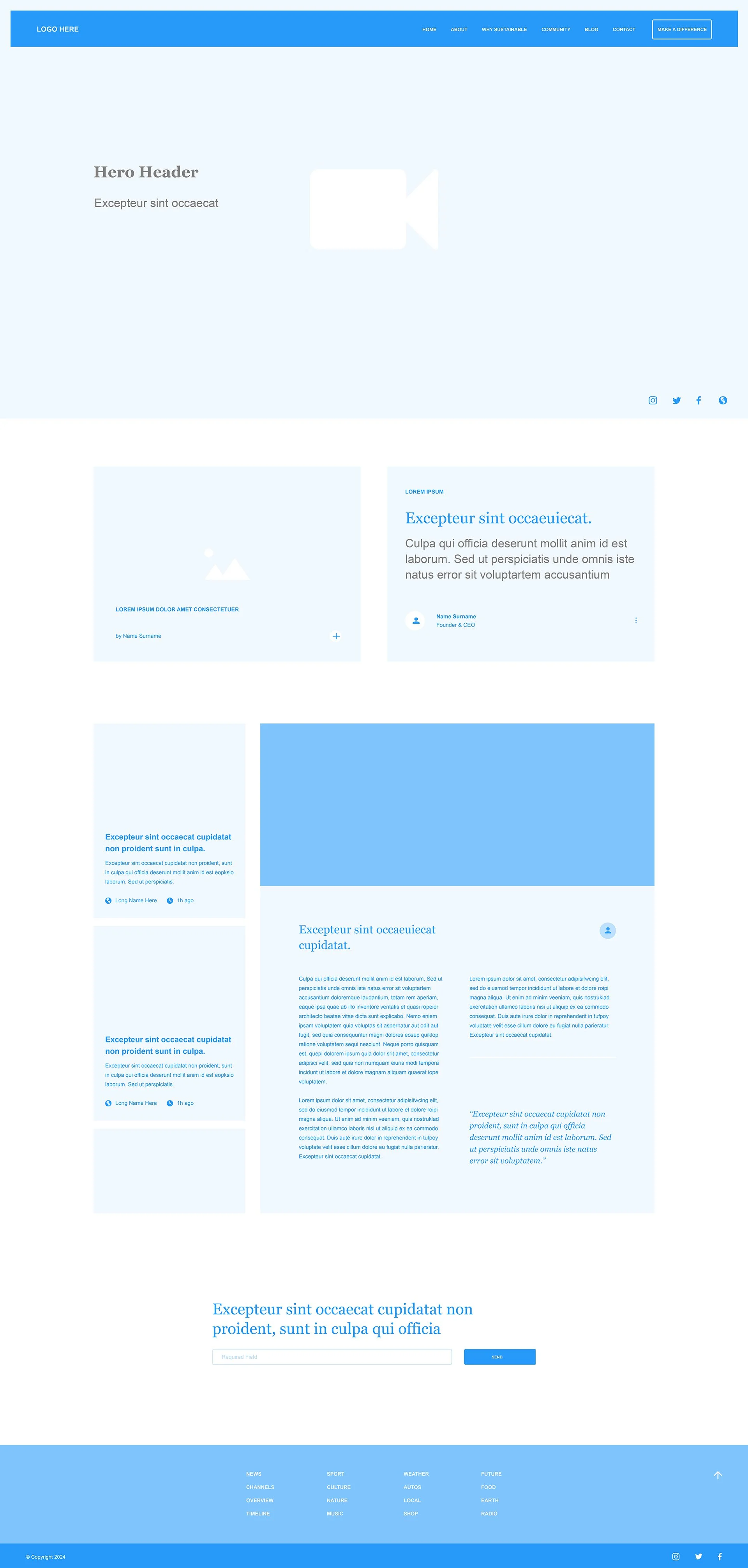
WEBSITE WIREFRAMES
The next step in the planning of the website was to create a few website wireframes. I chose to create three potential website wireframes for the home pages as a guide to get started. The structures of these wireframes could then be applied to other subpages when the final design was chosen. Ultimately, wireframe 2 was chosen as the foundation for the website because the large, edge-to-edge header provided the most room for the vibrant, bold graphics of Project ReThread. While wireframe 2 was chosen as the foundation, the final web pages utilized a few elements from all of these wireframes. For example, the blog layout from wireframe 1 was implemented and the headline and button layout from wireframe 3 was blended into the final header.


SOCIAL & PRINT MOODBOARD
With the idea that the social and print designs would share many of the same elements, I created one mood board for both. This was to keep the designs visually consistent across digital and print mediums.
SOCIAL ASSET PLANNING & CREATION
For the social media assets, I started by planning out the Instagram grid with a map of the grid pattern. This pattern would then influence the types of posts to be created for the grid. Based on the structure of the Instagram grid, I created Instagram posts, carousels, and Instagram Reels (with animated graphics). Even though these examples are heavily focused on Instagram, there is much potential for video and post crossover to TikTok and even Facebook in expanding to audiences on those platforms. As supported by the research, Instagram and TikTok were identified as applications that Gen Z uses daily (Boffone, Mittmann, Nugroho, Seemiller, White). Facebook was not identified as a primary app for Gen Z, but it is worth mentioning it as a possible app for expansion to other secondary audiences like millennials. During the planning phase, I also registered Instagram and TikTok usernames @projectrethread, both of which were free and available for registration.
In planning the social media assets, research greatly influenced the decisions made in the types of posts I designed. I leaned heavily into influencer-generated content, such as fashion hauls and promotions, as research shows that content that demonstrates how to select, elevate, style, and alter second-hand clothing is highly consumed on digital platforms (Pavich). During visual analysis for this thesis, I also found that companies like Adolfo Dominguez promoted circular fashion through their “Old Clothes” campaign as a way to show audiences how older clothing can still be worn in a modern way. They did this through a series of print and digital assets (Dominguez). Even ThreadUp’s website showed visual assets with basic styling of second-hand pieces (ThreadUp). Because of this research, I planned to create social media content that would give tips on sustainable and second-hand fashion that included selecting, styling, and altering clothing as a way to reduce fashion waste. Additionally, research from the literature review provided evidence of the value-action gap between Gen Z desiring to make sustainable choices and actually making those choices. A large part of this is a lack of knowledge and a deeper understanding of the consequences of ignoring the problem (Williams). As a result of this research, I also chose to incorporate educational elements into the visual assets by way of interactive quizzes and quick facts that are both jarring and informative as a way to promote sustainable fashion choices among Gen Z.


PRINT ASSET PLANNING & CREATION
For the print asset planning, I started with the project objectives identified earlier in this thesis based on the research findings. With these print pieces, it was important to raise awareness, make sustainable fashion accessible, and educate viewers on the deeper issues of not consuming fashion sustainably. With this in mind, I developed two kinds of print designs to achieve different goals. The first design is meant to inform and educate with a design that is bright in color with facts surrounding sustainable fashion. These are meant to catch attention and, in some cases, be a little jarring. The second design is meant to be more of a model/influencer photoshoot with quippy phrases that will appeal to Gen Z by speaking their language. This style of clean graphic with a fashion model to the right and bold, overlaid text to the left was inspired by posters from Adolfo Dominguez’s “Old Clothes” campaign (Figs. 1-2). Both styles are designed to make the viewer think and take action to either learn more or, at the very least, reconsider their fashion choices next time they are shopping. The print assets, while not as diverse as social assets, are meant to inform and be consumed quickly as the viewer is likely passing by the designs quickly on the street or while being transported via car, bus, or train. The brief and carefully crafted text along with both imagery styles are a reflection of this. Because Gen Z is primarily a digital generation (White), a heavier emphasis for this campaign is placed on social media content. However, there is still an opportunity to promote this campaign to Gen Z in public spaces. The print assets were designed with this in mind.
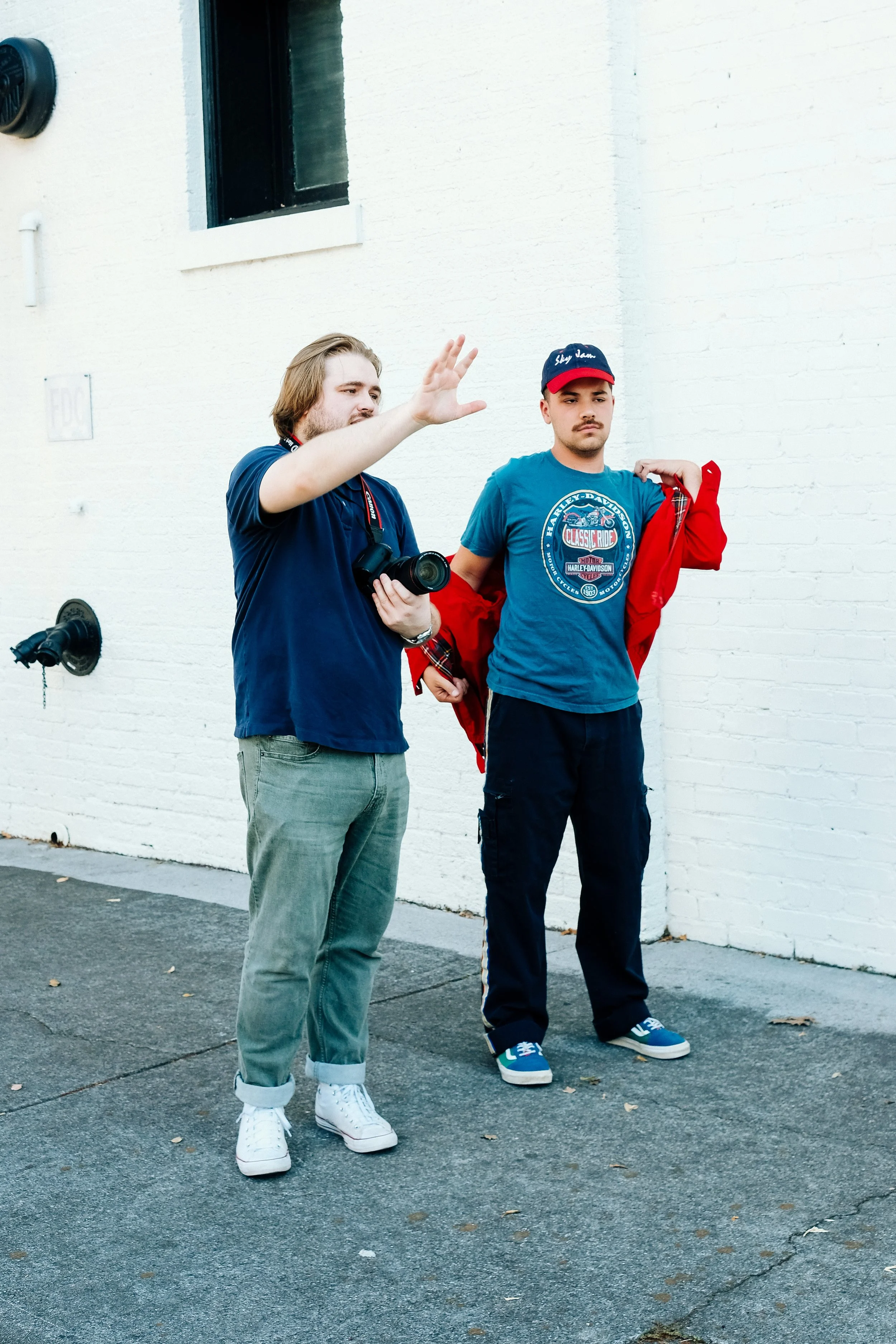
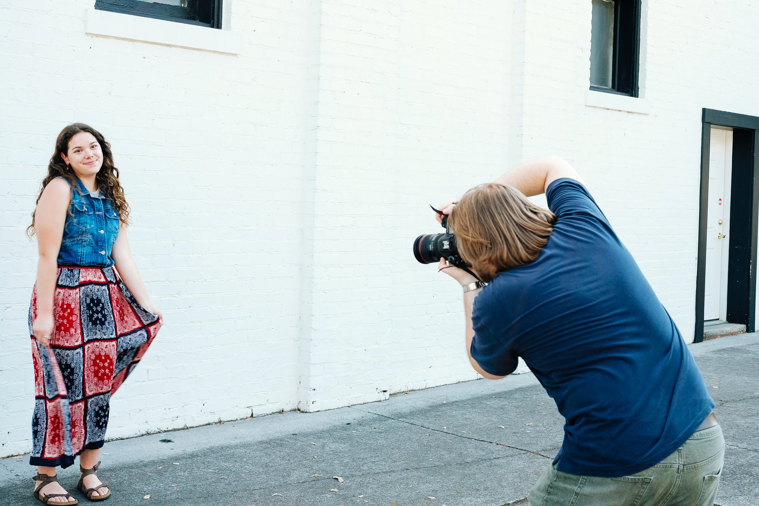
PHOTOGRAPHY
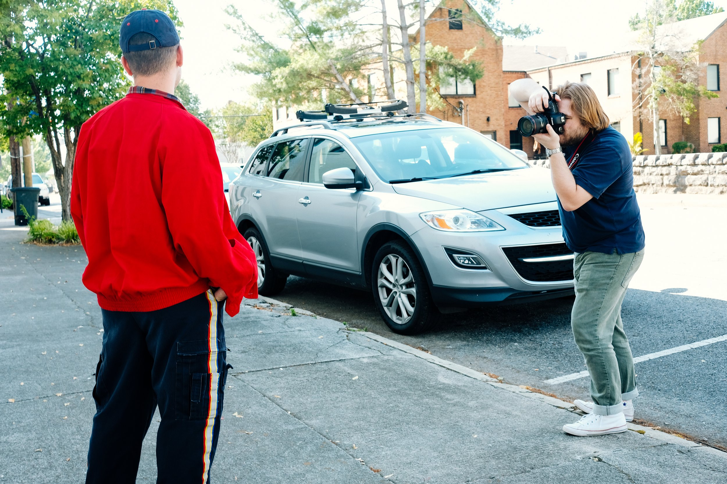
A large part of this visual solution was the photography of Gen Z models in thrifted and sustainable clothing. I shot all the photos of models used in this project, and I shot two distinct styles of photography:
Dramatic & Vivid: These photos are meant to showcase dramatic lighting and vivid colors that capture the diversity and energy of Gen Z. They were shot in a studio with lighting and digital backdrops. The appearance of these photos has changed over the course of the project, adapting and complementing the addition of brighter, natural lifestyle shots. This photo style was inspired by the successful studio shots of “Tommy for Life” from the visual analysis section, showcasing sustainable clothing and young, diverse models.
Natural Lifestyle: These photos are meant to showcase natural lighting and lifestyle photography, which is often used in fashion photography. These photos add an element of authenticity and relatability to the target audience. They were shot outdoors in bright lighting with neutral backgrounds. This photo style was inspired by the successful lifestyle photos from Adolfo Dominquez’s “Old Clothes” campaign and ThredUp’s social media photography from the visual analysis section. ThredUp’s photo style was especially studied as inspiration as its target audience is similar to that of this thesis project.
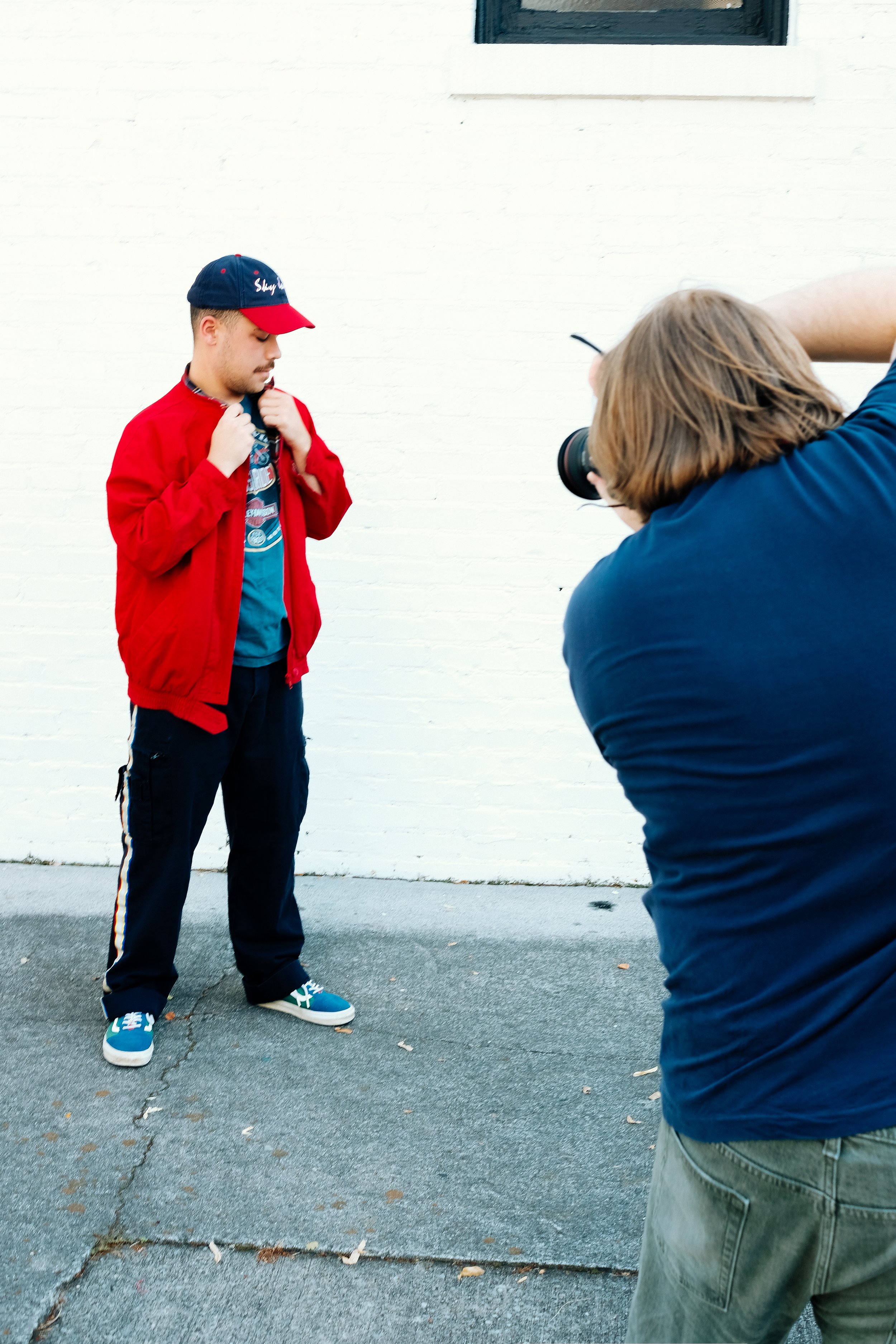
One of the photoshoot concepts was to show models wearing outfits curated from a local thrift store and then break the outfits down article by article in graphics for social media use. For authenticity in this shoot, the two models and I purchased all the clothing shown in the photos from thrift stores on the same day, and then we spent about an hour styling and shooting the photos.


Adjustments to the Photos & Editing Style: Over the course of this project, a few tweaks were made to the editing and style of the photography. I included more photos that better emphasize inclusivity through more photos and graphics of groups of people rather than only individuals. Additionally, after combining photos from different shoots, lighting, mood, colors, and styling started to become a challenge for visual consistency. I solved this with a consistent, brighter, film-like editing style across all of the photos that utilized similar base colors for the highlights and shadows of the photo. These colors were built from the Project ReThread brand colors. With this edit, there was enough consistency across photos from different environments, from studio shots to outdoor lifestyle shots.

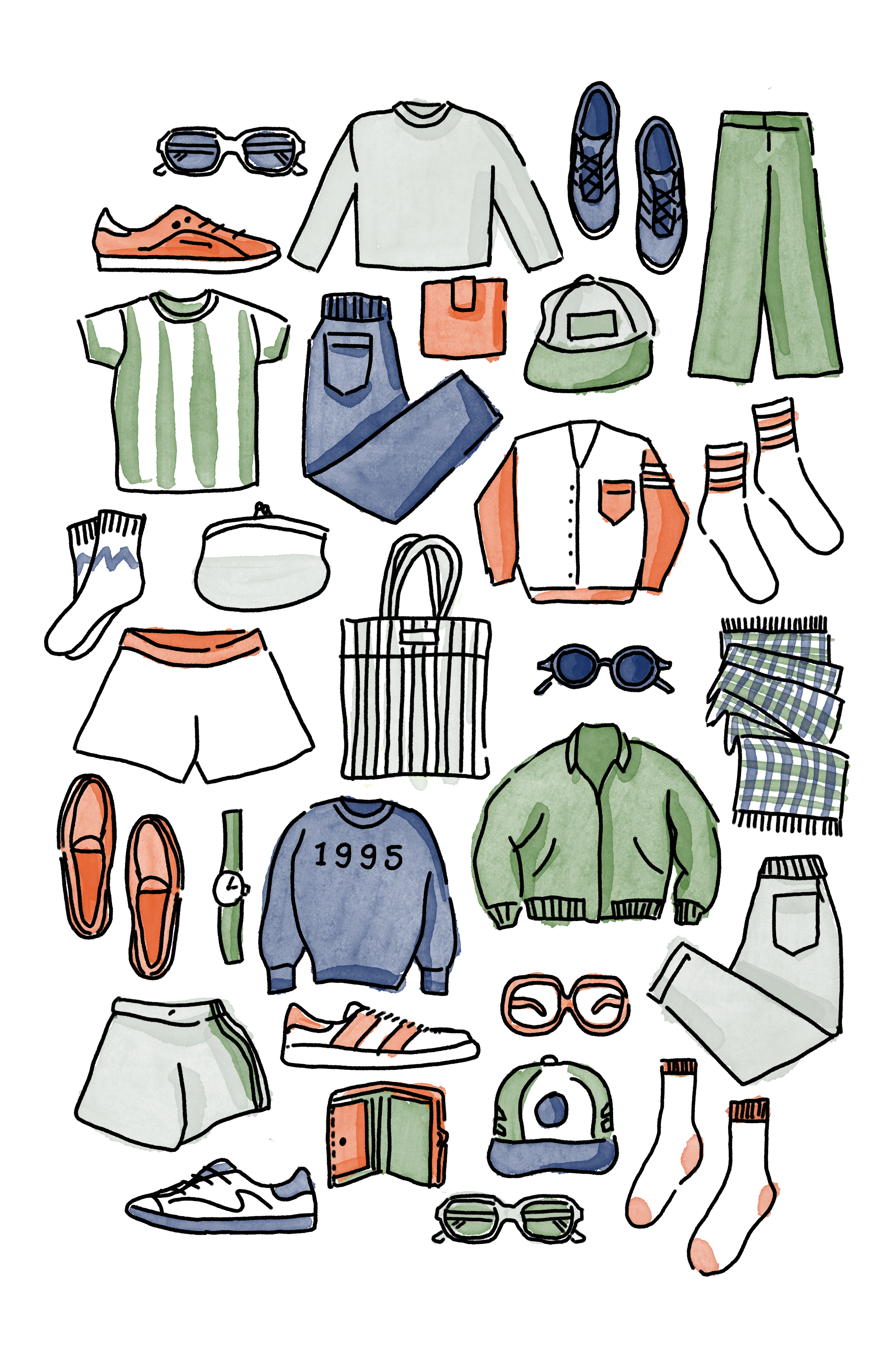
ILLUSTRATIONS & GRAPHICS
To complement the photography for this project, I also created hand-drawn illustrations and graphics influenced by visual research:
Collage Composites: The idea of these graphics was to create face-less models that were to achieve two purposes: 1) Create a form that was abstract enough that the viewer was not distracted by the model and could potentially view themselves in the clothing, and 2) To emphasize the clothing being worn, not the model. Though research does indicate that Gen Z pays attention and listens to objectively “attractive” influencers, these faceless graphics paired with the photography of actual models balance that desire while leaving room for the viewer to see themselves in the graphics. The collage composites were created from textured scans of vintage magazines purchased from thrift stores. This approach aims to create an element of craftiness and reusability, which is a common thread throughout the project. These collage composites, along with visual elements such as page rips, further support the idea of repurposing something for another purpose. The collage composite Gen Z model photos were purchased from iStock Photography and edited in Adobe Photoshop by overlaying the page textures on top of the models.

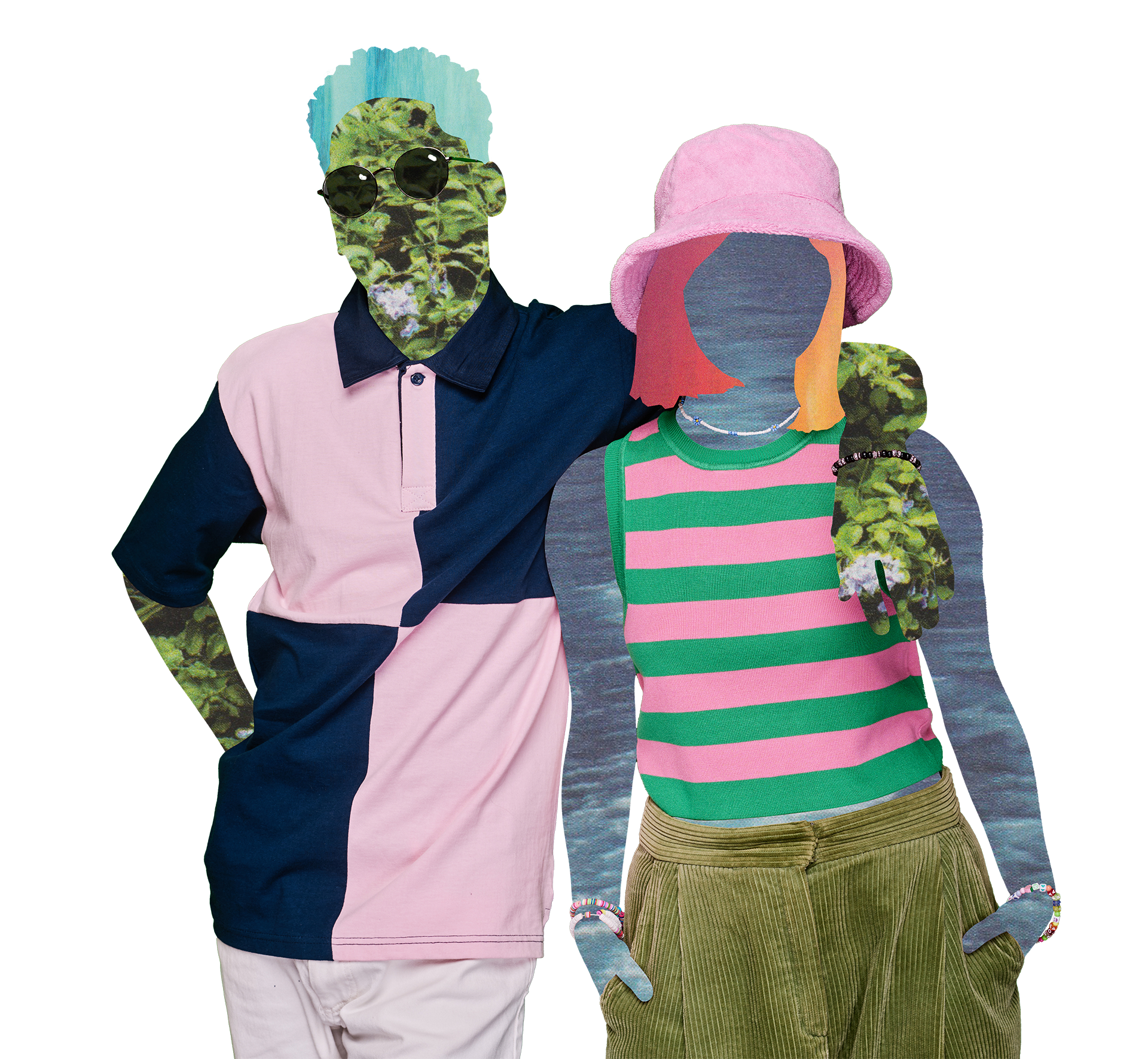
Illustrations: The illustrations were created as a supporting visual element to be used across digital and print marketing. The illustrations were inspired by the stylized illustrations from ThreadUP from the visual analysis section used in their social media marketing and on their website. These illustrations were successful in reaching a young audience with their bright colors and playful style. These are the characteristics I infused into the illustrated graphics. I achieved this by starting with loose, playful outlines that were simple in form. I then used a watercolor brush to add bright, vivid colors to the illustrations. The reason for choosing watercolor was to further support the crafty, collage elements. I created the illustrations using Procreate with an Apple Pencil on the iPad. Additionally, there were some doodle marks and outlines drawn directly on the photo inspired by the work in ThreadUP’s social media graphics. These outlines add movement and energy to the photos, giving them a youthful, carefree feeling. For the outlines, I was influenced by the work of Keith Haring from the 1980s. This style of illustration was well supported by the already vintage-flavored fashion showcased in the photography that Gen Z loves so much.
Adjustments to the Illustrations: Once the illustrated elements were placed, the watercolor aesthetic did not blend as well with the other elements as I had planned. The solution to this problem was to color the illustrations with the magazine paper cutouts rather than watercolor. To do this, I brought the illustrated outlines into Adobe Photoshop and digitally cut the paper pieces into shapes that would match the outlines, leaving some unfilled areas to serve as a highlight. These updated illustrations blended with the other visual elements better and created an opportunity for repetition for the collaged paper cutout elements.
Original Illustrations with Watercolor

Revised Illustrations with Paper Cutout Elements
Submitted in Partial Fulfillment of the Requirements for the Degree of Master of Fine Arts in Graphic Design at Liberty University
The thesis presented here is an educational exercise completed by students in pursuit of their degree. The student, committee, and Liberty University make no guarantee (expressed or implied) about the completeness, accuracy, reliability, or suitability of the information presented. The views and opinions (personal, religious, philosophical, or political positions) found in this project are solely those of the student and do not necessarily reflect the views or opinions of the committee or Liberty University.
A Special Thanks to my MFA Thesis Committee, whose time and guidance greatly helped shape this project. I could not have done it without you.
Chair: Bri O’Neal, MFA • First Reader: Bill Dewhurst, MFA, MA • Second Reader & Thesis Advisor: Joshua Wilson, MFA, MFA • Editor: Kendra Gray